Docs/Using the builder/HUD widgets
HUD widgets — the 9 building blocks
What each widget is for, the properties that matter, how variable binding works, and what you still do in UEFN (textures, timer rules).
Last updated 2026-06-12
Variable binding — live values on screen
Widgets that display game state bind to a player variable defined in Game Data. When a rule changes the variable, the widget updates on that player's screen automatically — the generated code injects the refresh after every mutation. The variable must exist (scope: player) before it appears in the widget's select.
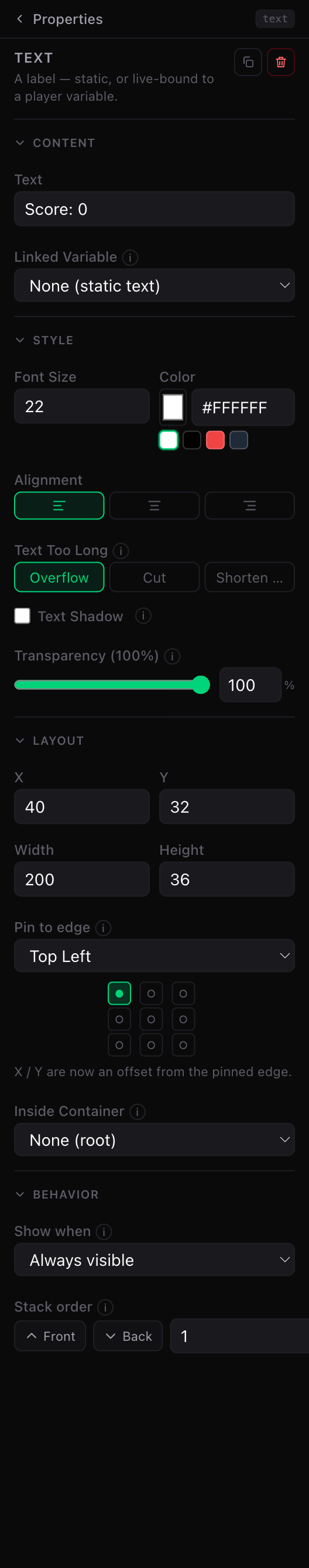
Text
A label — static, or live-bound to a player variable.
- Content: the text itself; optionally a Linked Variable — put
{value}in the text where the number should appear ("Coins: {value}"). - Style: font size, color, alignment, shadow (great on busy backgrounds), and what happens when the text is too long (Overflow / Cut / Shorten…).
💡 Tip
Bar
A fill bar driven by a player variable — health, mana, progress, coins.
- Content: the variable, the Full Bar Value (the value at which the bar reads 100%), and an optional text overlay ("3/10").
- Style: fill color and background color.
Image
A picture. The builder only knows its name — you assign the real file in UEFN.
- Content: the image name (becomes an
@editabletexture slot in the generated device) + an editor-only preview upload so your canvas looks right while you design. - Style: tint color.
📌 Note
@editable slot matching the image name.Button
Clickable — switches pages, sets variables, or fires your rules.
- Content: the label and the "When Clicked" action list — go to a page, close one, toggle, or set a variable. Multiple actions run in order.
- Style: Fortnite looks (Loud / Regular / Quiet) or Custom (no Fortnite chrome, optional image background).
- Behavior: Start inactive (greyed out until a rule enables it).
⚠️ Watch out
Timer
A clock display (mm:ss, ss, or mm:ss.ms).
⚠️ Watch out
Board (leaderboard)
A live ranking of players by a player variable.
- Content: the variable to rank by, the title, how many players to show (3–10).
- Style: fonts, colors, background (color or image), padding, row spacing.
The ranking refreshes automatically whenever any rule changes the tracked variable for any player.
Panel
A colored (or image) backdrop to visually group widgets — pure decoration, no behavior. For moving and showing things together, use a Group.
Group (container)
Holds widgets so they move, show and hide together. Arrangement: Free (place children anywhere), Column or Row (auto-stacked, with inner margin and spacing). Lock it to always select the whole group. Groups are the foundation of the screens system.
Line (separator)
A thin divider — horizontal or vertical, 1–5 units thick.
See also